

Let’s start with the room that can make or break a house. We all know the kitchen is the heart of the home. We eat there. We drink there. We catch up on the day there. We entertain there. We sneak ice cream and wine after the kids have gone to bed there. For real, stop acting like you don’t! If you missed my last post in this series, you may want to start there to get a feel for my husband and his credentials and my lack thereof. But in my mind it’s totally there, dude, so have some faith!
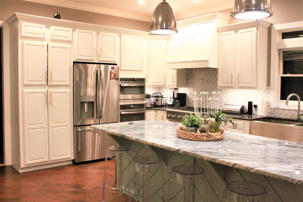
We all know the kitchen may be the most important and highly trafficked room of the house. It also happens to be the room that sold me on this home. Coming from our previous house that had a kitchen that couldn’t accommodate two people at once without bumping butts, our new kitchen is like the Taj Mahal in comparison. Check this baby out! Very niiice! Yes?
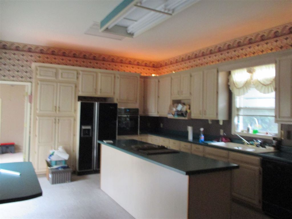
Okay, so maybe you’re not feeling it, and I get it. There’s carpet in the kitchen. That one’s still a mystery… The green laminate counter tops are super dated, and the wallpaper is making you dizzy. But guys, this house was built in the 90’s when wallpaper and borders were all the rage. Hunter green and mauve went together like peanut butter and jelly. Some country- style curtains with all the frills would set you back some dough, and I ain’t talking biscuits. My point is, it was nice back in the era of New Kids On the Block and Celine Dion, but in the 21st century-not so much…
So for starters, that carpet got ripped up quicker than a banty wolf (whatever the heck that is). Our options were tile or hardwood, but we opted for hardwood throughout most of the house for a cohesive look and flow throughout.
We were making the kitchen, dining, and living room more of an open concept. Keeping the same flooring throughout these rooms made the spaces feel larger and gave the impression of one big room without the choppiness that broken up flooring between rooms can give.
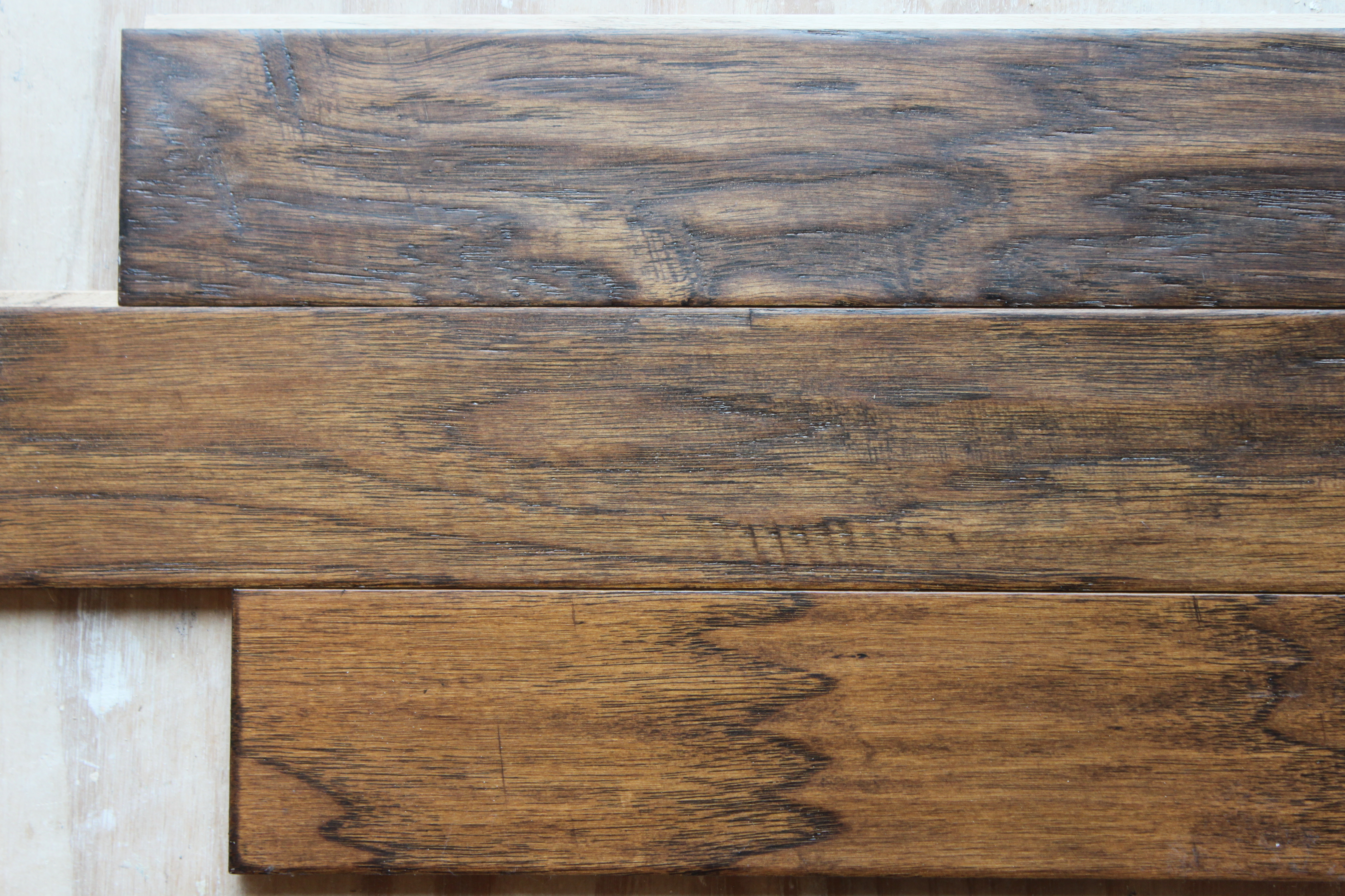
Your flooring will set you back some G’s if you’re doing the entire house so be prepared. We opted for manufactured hardwood over regular wood flooring for the following reasons.
Manufactured hardwood gives you more choices in sizes and color variations. We were looking for wider planks of wood and color depth with texture, which is what we found in our chosen sample. Another recommendation is that you stagger different sizes of planks to make the flooring more interesting.
Manufactured hardwood also has a factory finish on the surface that’s tougher than a normal finish, so you’re looking at better wear and tear. We have dogs, kids, and a freaking hoverboard so that was important to us! Another perk is that it doesn’t cup with humidity changes like typical hardwood can.
When you choose your color of flooring, you should consider these points. Very dark flooring (think walnut) gives a dramatic feel but can make a room seem smaller and way darker overall. An extremely light floor is more airy and can make the room seem larger but shows dirt much quicker and can be hard to keep clean. We compromised somewhere on the lighter end of the dark spectrum. The mixture of hues in the boards gave it warmth, and the color variations make dirt and dust less noticeable, not that we’d ever have any of that in my house! Wink
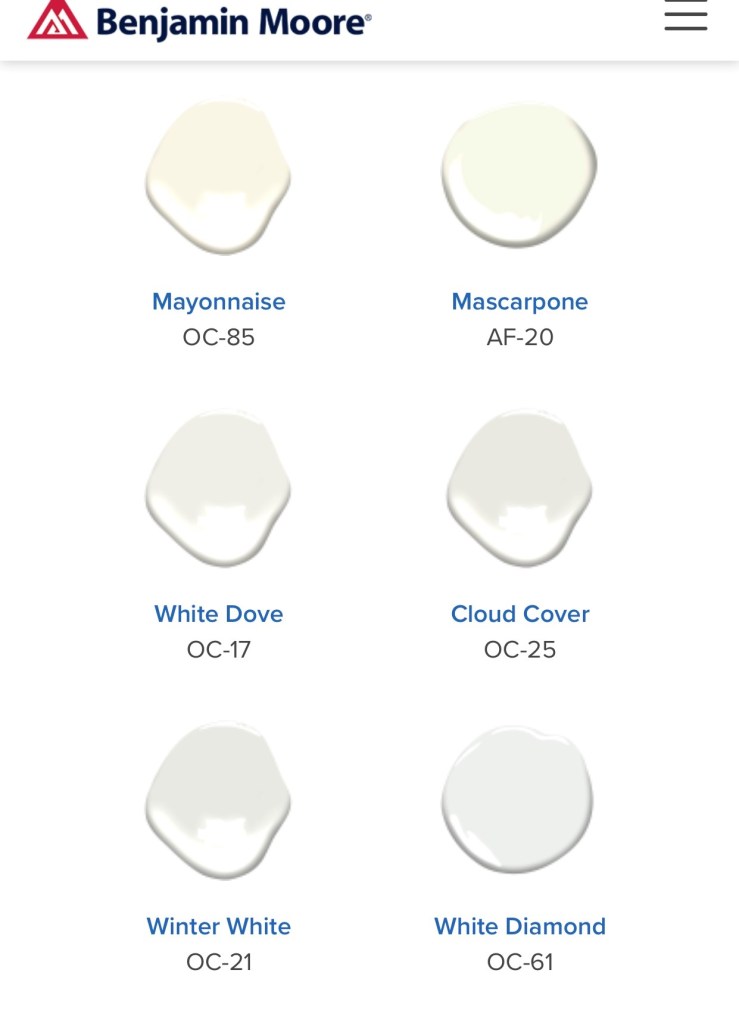
Now, let’s talk paint! Most of our rooms are the same color. This was a tough call for me initially because I’m drawn to lots of color–bright and bold ones, in particular. I’ve had rooms covering almost every shade of the rainbow over the years, but did tire of the paint colors quickly. By picking a neutral shade throughout, I could bring in color through pillows, rugs, furniture, and art on the walls. Much easier and cheaper to change these things out than to repaint rooms every two years when you’re over that dramatic red.
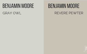
In my opinion, you can’t go wrong with a good greige. Tans and taupe can be a bit dated. Standard gray isn’t bad but is a cooler shade that sometimes seems a little more business than pleasure. I like the warmth and neutrality of greige. It’s the perfect marriage of two colors!
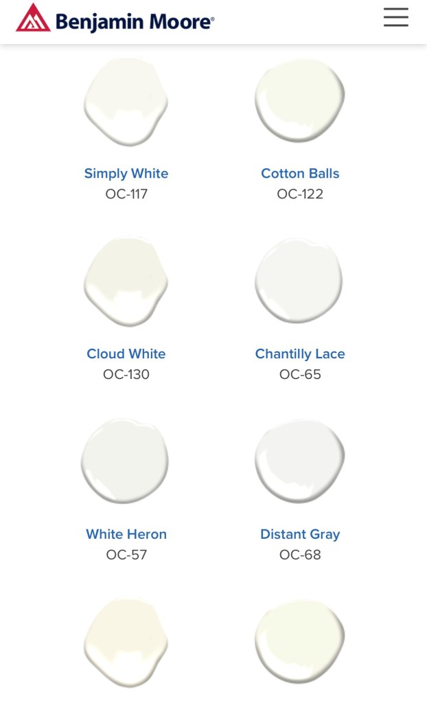
We went with Benjamin Moore Revere Pewter throughout the majority of the house. It goes with everything, isn’t too dark, and makes our home seem inviting. I give it an A+! The Gray Owl sample below is another great option.
This house has 1001 cabinets, which is amazing, but a fortune to replace. The existing cabinets were in great shape so we kept them, but they were dated and needed a face lift. I chose a soft white for the cabinets and new hardware for the handles and pulls. Unbelievable difference, guys! If you’re willing to roll up your sleeves, you can do this yourself and really transform your kitchen.
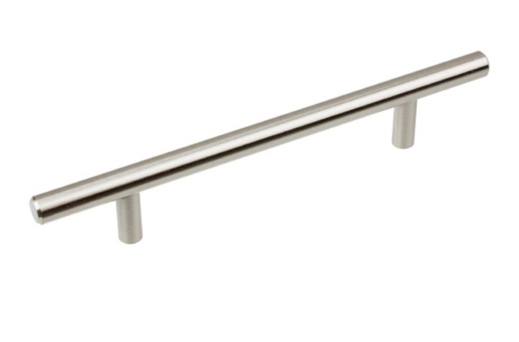
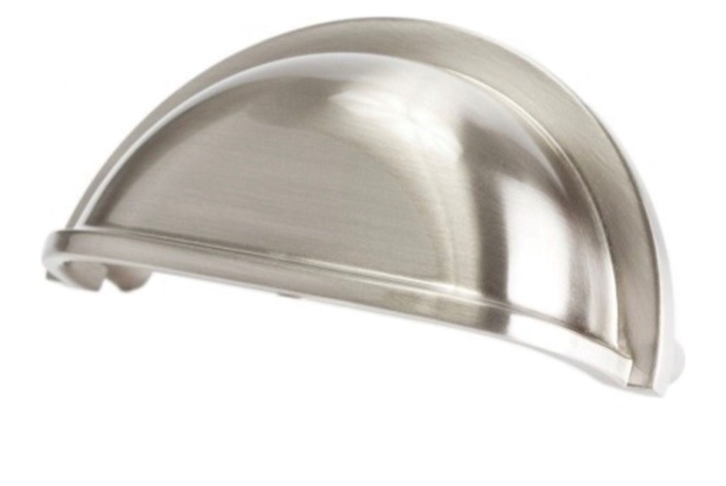
Overstock and Houzz were my go to’s for much of my cabinet hardware. I chose different sizes for the vertical handles, depending on the size of the cabinet. You want to make sure the scale is appropriate for the cabinet size to make it most visually appealing. Again, I like to go big when i can get away with it. When mixing drawer pulls and cabinet handles in the same room, you want to ensure they have the same finish to pull it all together. Mission accomplished!
For lighting, the boxed fluorescent light had to go. I replaced it with two pendant lights over the island and can lights throughout the kitchen to supplement. With pendant lighting, again going big is my preference, especially if it’s a large room. It adds more drama to the space and gives it a more luxurious feel. Southeastern Salvage in Nashville, TN has amazing lighting options and is where I scored mine.
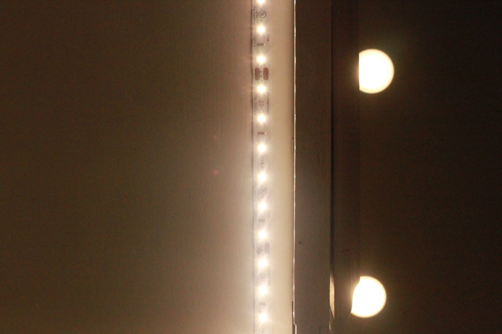
Another great way to add more light and warmth to a room is to use under cabinet lighting. It increases the light on my dark counter tops dramatically, and its soft glow makes the space super cozy. The picture shows the type we used. It’s a modern strip with only one switch and no cords hanging out.
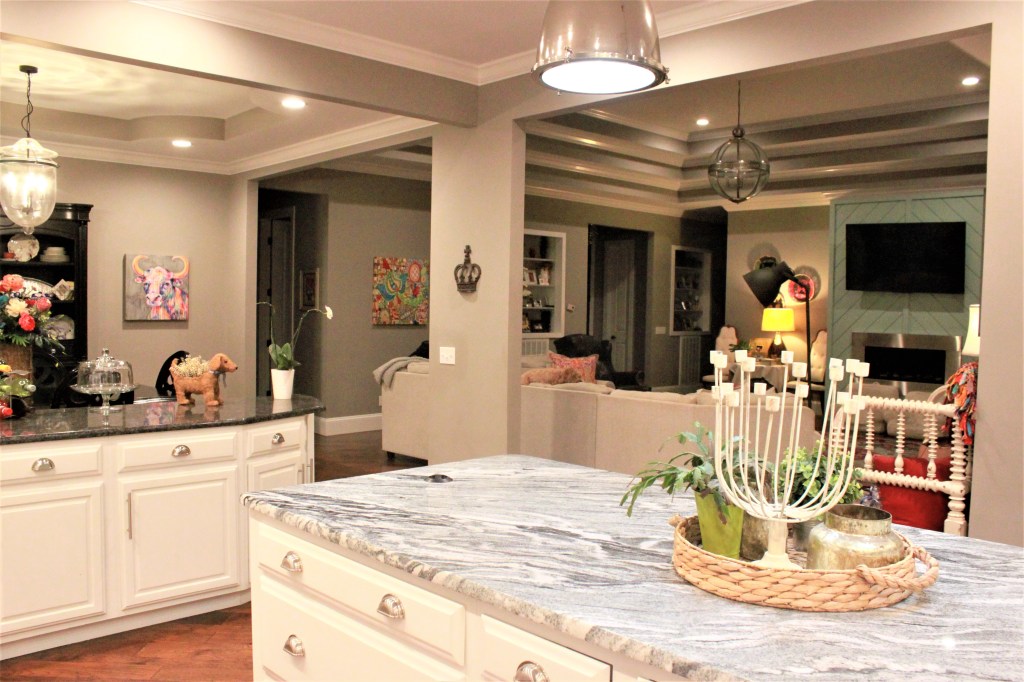
For counter tops, we opted for granite. It’s extremely durable and sanitary since it’s nonporous. You can place hot pans on it, and it’s pretty hard to screw up. I went with a dramatic swirl pattern in white, gray, and black for the island and a more subdued black granite for the other counter tops. The colors blend well but allow the island to take center stage, as it should. A pop of color on the island base with the texture of the wooden plank siding also gives it a modern feel.
If you don’t have an oven hood that makes a statement, it’s time to start thinking about getting one. The stainless steel ones are modern and cool but I’m in love with wooden hoods, and don’t get me started on copper! John built ours, and I couldn’t love it more. It pairs perfectly with the gas range, and makes you look like a Paula Deen even if you can’t boil water. When it’s time for a new range, gas is the way to go folks! It heats so much quicker and is easier to control. It’s no wonder it’s the choice for professional chefs. Once you go gas, you won’t go back! Mark my words.
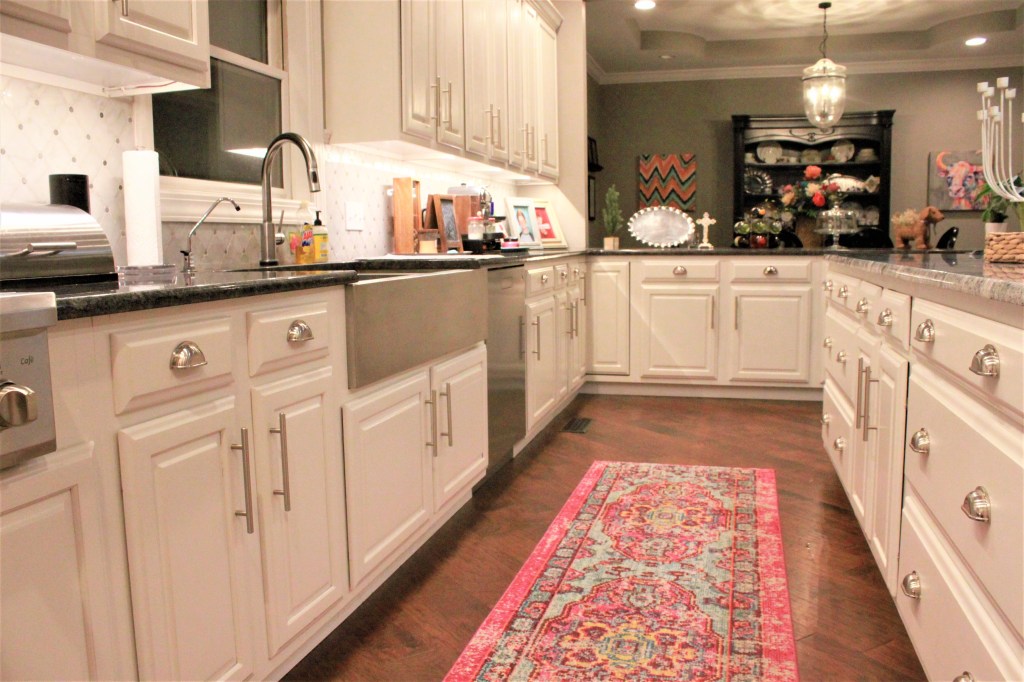
Because of the length of my kitchen, I’m using a bright carpet runner between the island and sink to bring in some color. I’m not sure how sanitary all that is but it looks hella good, so go for it!
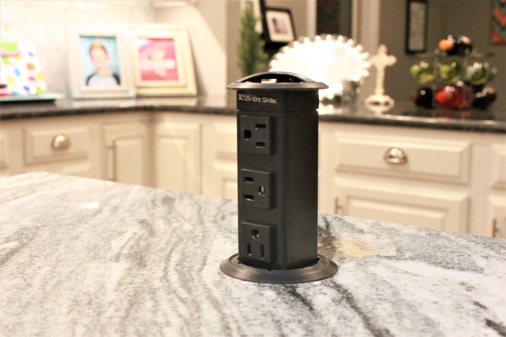
Another cool addition John added to our island is electrical outlets on both ends that pull up out of the counter top. Super cool. Super useful. Worth the time to do. I can work on my laptop while it’s plugged in there. I can charge my phone while cooking. All of those kitchen items that you drag out on occasion that need an outlet are perfect for this so no stretching cords or running out of plugins.
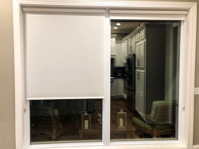
Luckily, our kitchen has loads of natural light, which I love. Every kitchen needs a window over the sink, although mine is still lacking a curtain. I’ll get there! These large floor length windows in the kitchen used to be sliding doors. There’s another set of those doors in the living room, so it seemed overkill and confusing to know which one to enter. We did away with the one in the kitchen, increased the size of the opening, and installed large windows in its place. It does get a bit toasty in the summer so we added blinds that are semi-transparent to still allow some light to filter through but minus the 5 degree temperature increase.
Lastly, let’s talk back splashes. They give the room character and can definitely make your kitchen stand out, as well as being practical. Since it’s not a huge square footage you have to cover, this is your chance to use that tile you’ve been pining for. We went with a marble lantern style that has a beautiful sheen to it that light bounces off of perfectly to make the black counter tops seem less heavy, if you will.
On this post, I won’t touch on how we knocked out walls and enlarged openings to obtain the open concept, but I’ll get there with my Take 3 so be looking for it! I’ll be covering our dining room in the next one so stay tuned.
Thanks so much for stopping in and until next time! xo, Christy

You are sooo good and writing this blog and decorating too. I must see your house once you finish this series!
LikeLiked by 1 person
Thank you so much, Craig! I really appreciate it and you are welcome to come see it anytime!
Just give me about an hour heads up to make sure it doesn’t look like Hurricane Dorian has come through it! Lol
LikeLike
Love what you are doing and like Craig said you should be an author! Beautiful home!! I wish I could have you come help me
With my 1970 home !
LikeLiked by 1 person
You’re too kind! Thanks so much, and I’d be happy to help!
LikeLike
This is very good advice! Very honest and practical. I really enjoyed this post. POST POST. These tips can help a great post. Granite Vanity Tops
LikeLiked by 1 person
I’m glad to hear you enjoyed it! Thank you, and yes—I hope to be more consistent! 😉
LikeLiked by 1 person